
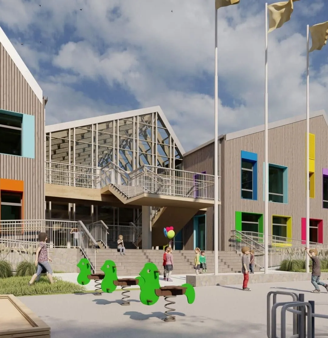
A 2,700 m² kindergarten with coloured window frames and a bright shared court. Repeated volumes create an architecture that is both orderly and playful.
06 / A legible world
Colour finds its place.
Colour can orient a space, give it rhythm and make it memorable. An idea becomes stronger when we can explore it together.
23 projects / An evolving body of work
Scroll to change your perspective ↓
01 / The practiceA worldwide outlook
Architecture
beyond the object.
We design master plans, buildings, interiors, objects and the ways of working that bring them into being.
JTA Architecture is a boutique practice with a worldwide outlook. We bring architectural design, external research and intelligent workflows into one practice, working with people and their agents.
Every engagement begins with what you want to achieve. We draw on knowledge beyond our own portfolio, explore alternatives and make the basis of each decision visible. The work should be open to questioning, testing, revision and continuation.
Our contribution must earn its place: by improving the result, reducing the effort it takes to get there, or making a useful next step possible.
Capabilities / Human + agent access
What JTA can deliver.
Explore the architectural capabilities JTA can bring into a commission, a focused study or an authorized agent workflow - including regulatory coordination, BIM, construction and manufacturing information, research and agent-to-agent delivery.
Explore capabilities
Architectural commissions.
Buildings, interiors and shared places. From the first brief through BIM and construction documentation to information for fabrication, assembly and building production.
Learn moreResearch & design studies.
A focused question, a set of alternatives or a decision to resolve. Evidence and design brought together around a clear purpose.
Learn moreWork with your agent.
Your agent can connect directly with Ask JTA to define a focused design or research task, agree inputs and deliverables, and follow progress. Receive reviewable results your agent can assess, use and carry into your workflow.
Learn moreFrom the first question, together.
02 / The journalSpace / Material / Life
Ways of seeing.
Architecture, research and the possibilities we can develop together. Each perspective is a place to begin a conversation.
 01
 02
 03
 04
 05
 06
 07
 08
 09
 10
 11
 12
 13
 14
 15
 16
03 / The collectionA portfolio in motion
Colour & identity
From learning environments to workplaces, a measured use of colour makes the architecture more recognisable at the scale of everyday life.
Colour helps people recognise and understand a place. Its effect depends on where it appears, how much of a surface it occupies and what surrounds it. We use colour alongside geometry, material and light to give a building a readable identity. The strongest gesture is often a precise relationship between a vivid element and a quieter background.
The Kindergarten uses brightly coloured window frames within repeated timber-clad volumes. Individual openings gain a recognisable character while the facade retains its underlying order. At the technology office, green surfaces, circuit-like graphics and illuminated computer equipment bring the identity of a technology workplace into its reception. The compact plan uses these elements to distinguish surfaces without requiring large spatial divisions.
The retail centre makes its address visible through warm-coloured exterior planes and a contrasting glazed entrance volume. The showroom develops colour through veined materials, timber and dark horizontal bands inside an open interior. In the facade-renewal study, the graphite facade palette provides a common setting for the hexagonal screen and its integrated light. Across these scales, identity comes from a coordinated system of surfaces and openings, with colour helping the visitor read the composition.
This is also a way to begin a material, identity or wayfinding study. We can explore how a palette behaves across surfaces, under changing light and along a route, drawing on external research and product information. A useful proposal distinguishes an aesthetic intention from a requirement that still needs a sample, measurement or user review. Ask JTA can help turn your references into a brief, with alternatives and decision criteria that you or your agent can examine together.
A 140 m² workplace that makes technology part of its visual identity. Illuminated equipment, vivid colour and a sculptural reception animate a compact interior.

Terracotta-coloured volumes frame a glazed central space. A clear entrance and a strong contrast between solid and transparent surfaces give the retail centre its identity.
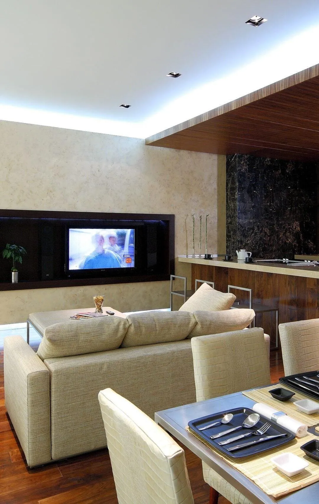
A showroom apartment composed through freestanding planes, strong material contrasts and a floating canopy. Each surface helps define the room around it.
A renewed facade identity for an existing office complex combines retained building volumes, a hexagonal screen and integrated lighting, with a distinct presence by day and after dark.
A place to begin. A conversation to carry forward.
View the project index